Where Should the Try-On Button Go on a Product Page?
By the ZeDaq.ai team · · 4 min read
On this page
- Why does button placement matter?
- What are the best places for a try-on button?
- Should the button be above the fold?
- How should you design the button?
- What mistakes should you avoid?
- What should sit next to the button?
- How should the layout differ on mobile and desktop?
- How do you handle variants and colorways?
- How do you place the button on different platforms?
- How do you test placement?
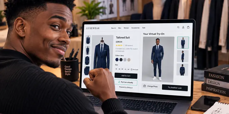
Put the try-on button close to the size selector and the add-to-cart button, where shoppers are already deciding whether the garment will suit them. On mobile, it should be visible without a long scroll and should not compete with the main purchase button.
This guide covers placement options for store owners who use a virtual fitting room on clothing websites. It focuses on layout, wording near the button, and how to test.
Why does button placement matter?
A try-on feature only helps if shoppers find it at the moment of doubt. That moment is usually when they look at the size options or wonder how the garment will look on them.
If the button sits far from those controls, it reads as a separate feature, and many shoppers will skip it.
What are the best places for a try-on button?
| Position | Pros | Cons |
|---|---|---|
| Directly under the size selector | Close to the sizing question | Can crowd the buying area |
| Beside the product gallery | Linked to how the garment looks | Easy to miss on mobile |
| Below the add-to-cart button | Keeps the main button clear | Lower visibility |
| Floating button | Always visible | Can feel intrusive |
For most stores, start under the size selector, test it, and change one thing at a time.
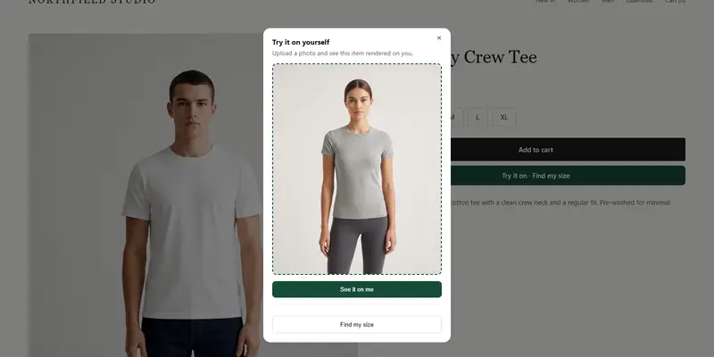
See a try-on button on a live product
Try it on yourself
Live renderUpload a photo, pick a piece, see it rendered on you.
Pick something to try on
Should the button be above the fold?
Above the fold means visible without scrolling. On a phone, the screen is small, so the photo, title, price and size selector take most of it.
Aim for the button to appear within a short scroll of the size selector. It does not have to be the first thing on the screen. It only needs to be easy to see when the shopper reaches the buying controls.
How should you design the button?
Follow these checks:
- Make it a secondary button. Add to cart stays the main action.
- Use an icon plus text. A camera or person icon with a clear label works better than an icon alone.
- Keep contrast high. It must stand out from the background.
- Size it for thumbs. Give it room to tap on mobile.
- Keep it on one line. Short labels fit narrow screens.
For wording ideas, see writing microcopy for the try-on button.
What mistakes should you avoid?
- Hiding it below the description. Shoppers rarely scroll that far before deciding.
- Placing it far from the size selector. The two belong together.
- Making it look like an ad. A banner-style button gets ignored.
- Competing with add to cart. Two bright buttons of the same weight split attention.
- Inconsistent placement. Put it in the same spot on every product page so shoppers learn where to look.
What should sit next to the button?
A short helper line improves clarity. Something like "Upload one photo to see this on you" tells the shopper what happens before they tap.
Keep the line to one sentence. For size questions, pair the try-on button with a link to your size guide, so both options are close to each other. A shopper who wants only a size can use "Find my size", and one who wants to see the look can use "Try it on".
How should the layout differ on mobile and desktop?
On desktop there is room beside the gallery, so a side placement can work. On mobile, the layout stacks, and the button belongs in the buying column, close to the size options.
A floating button on mobile should not cover the add-to-cart button or the sticky bar some themes add. Test on a real phone, not only a narrow browser window.
How do you handle variants and colorways?
If a product has several colors, the button should try on the color the shopper has selected. Check the behavior on each variant, then read how try-on works with product variants.
How do you place the button on different platforms?
On Shopify, the app embed lets you place the button from the Theme Editor. See placing a try-on button in your theme with app blocks.
On WooCommerce, Wix, Squarespace, BigCommerce and custom sites, ZeDaq.ai uses a script-tag widget you paste into the product template. The widget adds "Try it on" and "Find my size", and developers can read the WooCommerce hooks for a try-on button to choose a position.
How do you test placement?
- Choose one product page template.
- Place the button in position A for a set period.
- Move it to position B for the same period.
- Compare how often shoppers open try-on and how many reach the cart.
- Keep the better position.
Change only one thing each time, so you know what caused the difference. Generative AI is also changing what shoppers expect, as covered in where try-on fits in generative AI.
Try the shopper experience first
FAQs
Should the try-on button replace the add-to-cart button?
No. Try-on supports the decision. Add to cart should remain the main action.
Does the button need to be on every product?
It is most useful on garments where fit or look is uncertain. Start with your best-selling clothing pages.
Should I put the button in the product gallery?
You can, but check mobile. If it is easy to miss there, add it near the size selector too.
What label works best?
Use a plain action such as "Try it on". Short, clear labels are easier to read on a small screen.
Try ZeDaq.ai free
Virtual try-on and Find my size for your store, plus client, order and invoicing tools for tailors, in one subscription.