How to Write Microcopy That Gets Shoppers to Use Try-On
By the ZeDaq.ai team · · 4 min read
On this page
- What makes a good try-on button label?
- Which words should you avoid?
- What should the helper line say?
- How do you reassure shoppers about their photo?
- How do you write microcopy for different moments?
- How should copy change for gift or occasion shoppers?
- What do before-and-after rewrites look like?
- What tone fits a fashion store?
- What checklist should you run before publishing?
- How do you test your copy?
To write microcopy that gets shoppers to use try-on, keep the button copy short, names the benefit, and tells shoppers what to do next. "Try it on" beats "Launch virtual experience" because it says exactly what happens.
Microcopy is the small text around a feature: the button label, the helper line and the privacy note. This guide is for store owners adding a virtual fitting room to a clothing website who want more shoppers to try it.
What makes a good try-on button label?
A good label is a verb plus a simple object. Shoppers should understand it at a glance.
Compare these:
| Weak | Better | Why |
|---|---|---|
| Virtual experience | Try it on | Says the action |
| Use AI | See it on you | Names the benefit |
| Launch | Find my size | Names the result |
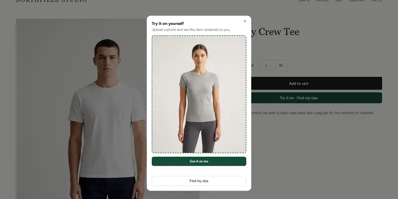
ZeDaq.ai's widget adds "Try it on" and "Find my size" for you, and you can keep those labels or write your own around them.
Which words should you avoid?
Skip words that sound technical or promise too much. "AI-powered" tells the shopper nothing about what they get. Hype words feel pushy.
Also avoid vague claims such as "perfect fit." No tool can promise that. Write what the tool does, such as "See this jacket on your photo."
Read the copy on a working try-on
Try it on yourself
Live renderUpload a photo, pick a piece, see it rendered on you.
Pick something to try on
What should the helper line say?
The helper line sits under or beside the button. It answers the shopper's quiet question: "What do I have to do?"
Good examples:
- "Upload one photo and see this on you."
- "Add your height to get a size."
- "Takes about 30 seconds."
Say only what is true for your setup. The size scan takes a short body scan from one photo plus height, so a line like "One photo and your height" is accurate.
How do you reassure shoppers about their photo?
Photos feel personal, so address the worry in plain words near the upload step. Say what happens to the photo, but only what is true for your setup.
For sizing, the photo is analyzed in the shopper's browser and only measurements are sent. If the shopper runs a try-on, the photo is sent to create the image. Use wording that matches the step the shopper is on.
How do you write microcopy for different moments?
Match the words to the point in the journey:
- On the product page: invite the shopper, for example "Try it on".
- At the upload step: give instructions, such as "Stand straight, full length in frame."
- During loading: set expectations, such as "Creating your preview."
- On the result: offer a next step, like "Add to cart" or "Find my size".
- On an error: say what to fix, for example "Please use a full-length photo."
On a phone, space is limited, so see what shoppers experience on mobile vs desktop when you shorten text.
How should copy change for gift or occasion shoppers?
Shoppers buying for an event or for someone else need different words. They may want to check how a garment looks for an occasion, not only the size. Read how try-on helps gift and occasionwear shoppers for ideas.
What do before-and-after rewrites look like?
Here are rewrites you can adapt:
| Before | After | What changed |
|---|---|---|
| "Experience our AI fitting technology" | "See this dress on you" | Names the benefit |
| "Upload image" | "Upload a full-length photo" | Says what kind |
| "Processing" | "Creating your preview" | Tells what is happening |
| "Error" | "Try a full-length photo in good light" | Says how to fix it |
| "Sizing" | "Find my size" | Says what the shopper gets |
Notice that each rewrite uses plain words and speaks to the shopper directly.
What tone fits a fashion store?
Match your brand voice, but keep clarity first. A playful brand can say "Try it on, no fitting room needed." A formal brand can say "View this garment on your photo."
Whatever tone you choose, avoid exclamation marks and hype. They read as pushy, and they do not tell the shopper anything new.
What checklist should you run before publishing?
- The button label is two or three words and starts with a verb.
- The helper line says what the shopper must do.
- The upload step explains the photo needed.
- The privacy note matches what really happens.
- Error messages say how to fix the problem.
- Every line fits on a phone screen.
How do you test your copy?
Change one line at a time. Compare two labels for a set period and see which one gets more taps. Keep a record of the winner.
Size information also helps shoppers trust the result, so pair good microcopy with size guides that reduce returns.
See try-on from the shopper's side
FAQs
How long should a try-on button label be?
Two to three words is usually enough. Short labels fit narrow mobile screens.
Should I mention AI in the button?
Usually not. Shoppers care about what they can do, so lead with the action or benefit.
Should I promise a perfect fit?
No. Describe what the tool does, such as showing the garment on the shopper's photo or suggesting a size from your chart.
Where should the privacy note go?
Put it next to the upload step, where the shopper decides whether to share a photo.
Try ZeDaq.ai free
Virtual try-on and Find my size for your store, plus client, order and invoicing tools for tailors, in one subscription.