How to Show Shoppers That Try-On Results Are Previews
By the ZeDaq.ai team · · 4 min read
On this page
- Why should you label results as previews?
- What should the wording say?
- Where should the label go?
- How do you explain fabric limits?
- How should the wording work for older shoppers?
- What should you avoid in preview wording?
- What if a shopper complains the result looked different?
- How can you test your wording?
- What does a good preview setup look like?
- What is a placement checklist?
To show shoppers that virtual try-on results are previews, put a short label directly on or beside the result image, and repeat it near the size and buy buttons. Use plain words such as "Preview of how this garment may look on you. Check the size guide for fit."
A try-on image shows the store's garment on the shopper's photo, but it can't show everything. This guide explains what to say and where. It builds on virtual fitting rooms for clothing websites.
Why should you label results as previews?
Shoppers read a rendered image as a promise. If fabric, color or length looks different in person, they feel misled and may return the item.
A clear label sets the right expectation. It also keeps the focus on the size chart for fit decisions.
This isn't a legal opinion. If you are unsure about rules in your market, ask a qualified adviser.
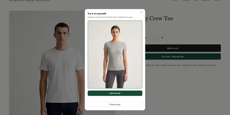
See a try-on preview yourself
Try it on yourself
Live renderUpload a photo, pick a piece, see it rendered on you.
Pick something to try on
What should the wording say?
Keep it short, factual and in plain language. Good copy covers three points:
- The image is a preview, not a photograph of the item on the shopper.
- Color and texture may look different on screen.
- Fit depends on the size chart and the garment.
Examples you can adapt:
- "This is a preview. Real color and fabric may look different."
- "Preview of how this item may look on you. For fit, use our size guide."
- "Try-on images are a guide, not a guarantee of fit."
Avoid claims such as "perfect fit" or "exactly how it will look".
Where should the label go?
Place it where the shopper is looking, not in the footer.
- On the result: a small caption directly under or over the image.
- Next to the size suggestion: so it's clear the size comes from your chart.
- Near the add-to-cart button: one line is enough.
- In the product description or FAQ: a fuller explanation.
On mobile, make sure the label doesn't disappear behind a sticky button.
How do you explain fabric limits?
A still image can't show everything about how cloth moves. The guide on whether virtual try-on can show how fabric drapes explains this in depth.
Pair the try-on with real details: fabric content, stretch, lining, and a note such as "relaxed fit" or "runs small". These come from you, not the image.
How should the wording work for older shoppers?
Use larger type, high contrast and short sentences. Don't hide the label in a light grey tooltip. The article on designing try-on for older shoppers covers readable layouts.
What should you avoid in preview wording?
Some phrases create the very expectation you are trying to avoid.
- "Exactly as you'll look": a render is not a photograph.
- "Guaranteed fit": fit depends on size, fabric and personal preference.
- Long legal blocks: shoppers skip them.
- Tiny grey text: if it's hard to read, it doesn't count as a label.
Short and visible beats long and hidden.
What if a shopper complains the result looked different?
Reply kindly, point to the label they saw, and offer the same help you'd give for any fit issue. Then check whether the label was easy to see on their device.
If several shoppers raise the same point, such as color looking different, improve the product photos or add a color note. The preview label should support good product information, not replace it.
How can you test your wording?
Ask three people who haven't seen the page to try it on and tell you in their own words what the image means. If they say "that's how it will look", the label needs work.
Review the wording again whenever you change the look of the try-on window.
What does a good preview setup look like?
With ZeDaq.ai, the shopper uploads one photo and sees the store's garment on their body. A "Find my size" option recommends a size from the store's own size chart, with a generic chart as a fallback. The label ties these together: the image is a preview, the size comes from your chart.
On WooCommerce, the same wording applies when you add the widget. See virtual try-on for WooCommerce for setup notes.
What is a placement checklist?
- The label sits next to the result image.
- The wording uses "preview", not "exact".
- Fit advice points to the size guide.
- The label is readable on a phone.
- The text is tested by someone outside your team.
- Product pages also list fabric and fit notes.
Try a preview on your own photo
FAQs
Do I need a disclaimer on every try-on result?
Putting one beside every result is the simplest approach, because it removes any chance a shopper misses it.
Will a preview label reduce how many shoppers use try-on?
There is no data here either way. A short, friendly label is unlikely to put people off, but test it on your own store.
Should the label mention the photo shoppers upload?
If your store processes uploaded photos, say so briefly and link to your privacy policy. Ask a qualified adviser about your obligations.
Can I use the same wording for size recommendations?
Yes, with a tweak: "Suggested size based on our size chart. Check fit notes before ordering."
Try ZeDaq.ai free
Virtual try-on and Find my size for your store, plus client, order and invoicing tools for tailors, in one subscription.