Designing Try-On for Older Shoppers
By the ZeDaq.ai team · · 4 min read
On this page
- Why design for older shoppers on purpose?
- How should the interface look?
- How should the steps be worded?
- What should the result screen show?
- What about photos and privacy?
- How do you offer help?
- How do you handle returning customers?
- How do you test with older users?
- What is a quick design checklist?
- How do you keep the wording consistent?
To design virtual try-on for older customers, make every step large, readable and plain: big buttons, high contrast, short instructions, clear privacy wording and a visible way to get help. These choices also help younger shoppers, so you rarely need a separate version.
This guide is for store owners and designers. It does not claim that older shoppers behave in one way, because they don't. For the basics of the tool itself, see how a virtual fitting room for clothing websites works.
Why design for older shoppers on purpose?
Older shoppers often have strong buying power and clear fit needs. They may also face small text, low contrast or tricky gestures more than others do.
A try-on tool asks for a photo, a height and a few taps. Each step is a chance to lose someone who finds it confusing. A tool that is easy for them is usually easy for everyone.
Treat this as an accessibility topic. The Web Content Accessibility Guidelines from the W3C are the standard reference, so read the WCAG overview when you plan your design.
How should the interface look?
Follow these principles:
- Make text large. Use a readable base size and let people zoom without breaking the layout.
- Use strong contrast. Dark text on a light background beats gray on white.
- Make buttons big. Leave space between them to avoid mis-taps.
- Label every button with words. Icons alone are easy to misread.
- Avoid time limits. Don't remove a screen before someone finishes reading it.
How should the steps be worded?
Keep instructions short and concrete.
- Say "Take a photo of yourself standing, head to toe", not "Upload a full-body image".
- Show one example photo with a short tip, such as "Stand straight, in good light".
- Use one action per screen where you can.
- Tell people what happens next before they tap.
Test every message by reading it aloud. If it sounds technical, rewrite it.
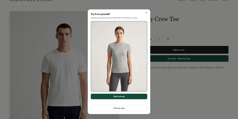
Try the flow yourself in the live demo
Try it on yourself
Live renderUpload a photo, pick a piece, see it rendered on you.
Pick something to try on
What should the result screen show?
After the scan or try-on, the shopper needs one clear next step.
- Show the size label in large type.
- Add one sentence in plain words, such as "We suggest size M".
- Offer a clear button to add that size to the cart.
- Let people retry without starting from the beginning.
Avoid showing several numbers at once. One answer is easier to trust than a table of choices.
What about photos and privacy?
Many people are careful about sharing photos. Answer the question before it is asked.
With ZeDaq.ai, the shopper uploads one photo on the store's own product page, with no account or app download. For sizing, the photo is analyzed in the browser and only the measurements are sent. If the shopper runs a try-on, the photo is sent to render the image.
Say this in plain words near the upload button. Don't hide it in a policy page.
How do you offer help?
Not everyone will finish alone. Give them a way out:
- A visible "Need help?" link to your contact details.
- A plain size chart as a fallback beside the tool.
- A clear option to skip the tool and choose a size manually.
Also keep the experience smooth on every device. Compare how try-on works on mobile and on desktop.
How do you handle returning customers?
Repeat shoppers who have used the tool once will find it easier the second time. Remind them gently, and explain what changed. The guide on introducing try-on to returning customers covers this.
How do you test with older users?
Watch real people use your store. Ask a few older customers or friends to try the flow on their own phones while you observe quietly.
Note where they hesitate. Fix the first problem, then test again. Even a handful of sessions shows you more than guessing.
If you run WooCommerce, the widget adds the buttons for you. See virtual try-on for WooCommerce for the setup.
See the shopper experience for yourself
What is a quick design checklist?
Review your try-on page against this list:
- Text is readable at the default zoom.
- Buttons are large and spaced apart.
- Every control has a word label.
- The photo tip fits on the same screen as the upload button.
- Privacy wording sits next to the upload.
- A help link and manual size option are visible.
How do you keep the wording consistent?
Pick one name for each feature and use it everywhere. If the button says "Find my size", don't call it "size finder" in the help text.
Consistent words reduce doubt. Shoppers who aren't confident with technology rely on repetition to know they are on the right path.
FAQs
Do older shoppers want virtual try-on?
Some do, and some prefer a plain size chart. Offer both and watch what your customers choose.
Do I need a separate version for older shoppers?
Usually not. Clear, large and simple design works for everyone.
Is the shopper's photo stored on my store?
For sizing, the photo is analyzed in the browser and only measurements are sent. Check the current ZeDaq.ai documentation for the try-on render details.
What accessibility standard should I follow?
The W3C's WCAG is the common reference. Start with contrast, text size and keyboard use.
Try ZeDaq.ai free
Virtual try-on and Find my size for your store, plus client, order and invoicing tools for tailors, in one subscription.