Virtual Try-On on Mobile vs Desktop: What Shoppers Experience
By the ZeDaq.ai team · · 4 min read
On this page
- How does a shopper start a try-on on a phone?
- How does it work on desktop?
- What are the real differences between the two?
- What should store owners design for on mobile?
- What should store owners design for on desktop?
- What does a shopper's journey look like on each device?
- How do you test both experiences before you launch?
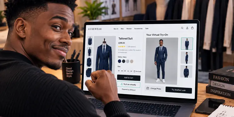
On mobile, virtual try-on is a quick tap-and-photo flow, because the shopper's photos are already on the phone in their hand. On desktop, the shopper has to find a photo file on their computer, so the flow takes a little more effort. Both lead to the same result: the store's real garment on the shopper's own photo.
This guide describes what each experience feels like and what store owners should test. It builds on virtual fitting rooms for clothing websites, and it assumes you want to see both sides before you launch.
How does a shopper start a try-on on a phone?
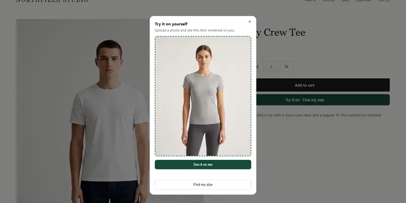
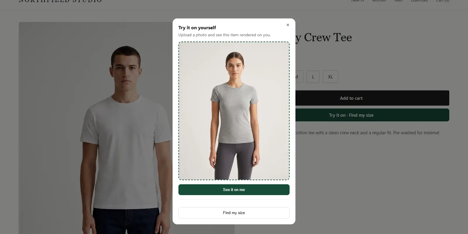
On a phone, the shopper taps a "Try it on" button on the product page and picks a full-length photo. The photo is usually one already saved on the phone.
Then the shopper sees the garment on themselves. The same window offers "Find my size," where they type their height and get a size from the store's chart.
Phones suit this flow for a simple reason: the photo is already on the device. Shoppers don't need to move files around.
How does it work on desktop?
On a desktop or laptop, the shopper clicks the same button and uploads a file from their computer. If the photo is on their phone, they have to transfer it first.
That extra step is the main difference. It is still straightforward for people who keep photos on their computer. For others, it may be easier to switch to their phone. Store owners should consider that when they think about where shoppers will try on.
What are the real differences between the two?
| Aspect | Mobile | Desktop |
|---|---|---|
| Getting a photo | Usually already on the phone | Upload a file from the computer |
| Screen | Small, one thing at a time | Larger, room for the garment and details |
| Interaction | Tap | Click |
| Product details | Scroll to see them | Often visible alongside |
Neither is better in every case. The right test is how your own shoppers behave, which you can see in your analytics.
What should store owners design for on mobile?
Shoppers on a phone are often in a hurry and using one hand. Design for that.
- Keep the button visible. It should not hide below a long description.
- Make tap targets large. Small links are hard to hit.
- Say what photo works. A short line like "Full-length, facing the camera, good light" helps shoppers get it right the first time.
- Keep the window easy to close. The shopper should return to the product page in one tap.
Different body types will also use the tool, so check how it handles them. See how try-on works for tall and petite shoppers for a closer look.
Open the demo on your phone and your computer
Try it on yourself
Live renderUpload a photo, pick a piece, see it rendered on you.
Pick something to try on
What should store owners design for on desktop?
Desktop shoppers have more room, so show them more. Keep the product details, the size chart and the try-on window available without leaving the page.
Explain how to get a photo from a phone, in case they have only taken one there. A short note works: "Send a photo from your phone to your computer, then upload it here."
If a shopper wants to see several items together, read outfit try-on explained for what is possible.
What does a shopper's journey look like on each device?
Here is an illustrative path on each.
On a phone: A shopper sees a dress in a social post and opens your store. They scroll the product page, tap "Try it on", choose a photo, and see the dress on themselves. They tap "Find my size", type their height, and read the suggested size.
On a laptop: A shopper browses at a desk with the size chart open in another tab. They click "Try it on", upload a photo they saved earlier, and compare the result with the product photos on the same screen.
The steps are the same. Only how the photo arrives and how much screen the shopper has are different. Plan your page for both.
How do you test both experiences before you launch?
Test with real devices, not only by shrinking your browser window.
- Open a product page on your own phone and complete a try-on.
- Repeat on a laptop, using a photo stored on the laptop.
- Run "Find my size" in each and confirm the size matches your chart.
- Try an older phone and a slow connection.
- Check the button placement against your theme on both screen sizes.
If you run WooCommerce, the widget goes in your product template, so test your template on both. The WooCommerce setup guide covers it.
See the shopper experience on your own device
FAQs
Does virtual try-on work on a phone browser?
Yes. The shopper uses it on the store's own site, so there is no separate app to download. ZeDaq.ai does not have a shopper app.
Does the shopper need an account?
No. They upload a photo and type their height on the product page.
Is the shopper's photo kept on their device for sizing?
For sizing, the photo is analyzed in the shopper's browser and only measurements are sent. If they also run a try-on, that photo is sent to render the image.
Which device do shoppers prefer?
That depends on your audience. Check your own store analytics to see which device your shoppers use.
Try ZeDaq.ai free
Virtual try-on and Find my size for your store, plus client, order and invoicing tools for tailors, in one subscription.