Shopify Product Page Layout for Fashion: What Goes Above the Fold
By the ZeDaq.ai team · · 5 min read
On this page
- What does "above the fold" mean on a phone?
- What should every fashion product page show first?
- How should the layout differ on mobile and desktop?
- Where does fit information belong?
- How do you add fit help in Shopify without code?
- What should you leave below the fold?
- What is a good checklist for your next page review?
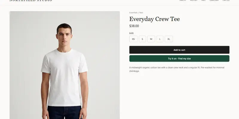
Above the fold on a Shopify fashion product page, show the main photo, product name, price, size selector, a way to get fit help, and the add to cart button. "Above the fold" means the part of the page a shopper sees before scrolling, and on a phone that is not much space.
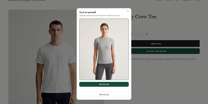
Fit help is the item most stores leave out. A virtual try-on button on Shopify belongs near the size selector, because that is where shoppers hesitate.
What does "above the fold" mean on a phone?
The fold is the bottom edge of the screen when the page first loads. Anything below it needs a scroll. Phone screens are narrow and tall, so the fold falls early in a product page.
Check your own pages on a real phone, not just a resized desktop window. Open a product, look at the first screen, and ask what a shopper can do without scrolling. If they can't pick a size or find fit help, the layout needs work.
What should every fashion product page show first?
Put these in the first screen, in roughly this order on mobile:
- Main photo. One clear image of the garment, ideally worn.
- Product name and price. Short, readable and not split across lines if possible.
- Color choice. Swatches or names, if the product has colors.
- Size selector. Visible buttons rather than a hidden dropdown, so sold-out sizes are obvious.
- Fit help. A size guide link, a "Find my size" option or a try-on button.
- Add to cart. Easy to reach with a thumb.
Everything else can sit below: long descriptions, reviews, care instructions and shipping details. Keep a one-line note about shipping or returns near the button if your policy is a selling point.
If you also show collections as styled looks, the guide to building a lookbook page shows how to link those looks to product pages.
How should the layout differ on mobile and desktop?
On desktop, you have room for a gallery beside the buying options. On mobile, the gallery stacks above them.
| Element | Desktop | Mobile |
|---|---|---|
| Photos | Gallery on the left | Swipeable images on top |
| Name and price | Right column, top | Directly under the photo |
| Size selector | Right column, near the top | Within the first screen |
| Fit help | Beside the size selector | Beside the size selector |
| Add to cart | Right column, below sizes | Below sizes, or a sticky bar |
| Description | Below or in tabs | Collapsible sections |
A sticky add to cart bar can help on long mobile pages, but only if it doesn't hide the size selector. Test it on a small phone.
Where does fit information belong?
Next to the size selector, not buried in a tab. A shopper who is unsure about size will look for help at the moment they choose one.
Good options, from lightest to heaviest:
- A fit note. One line such as "Runs small, size up if between sizes".
- A size guide link. It opens your size chart in a popup or a section below.
- A size recommendation. The shopper gives a little information and gets a size from your own chart.
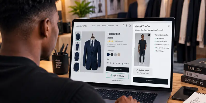
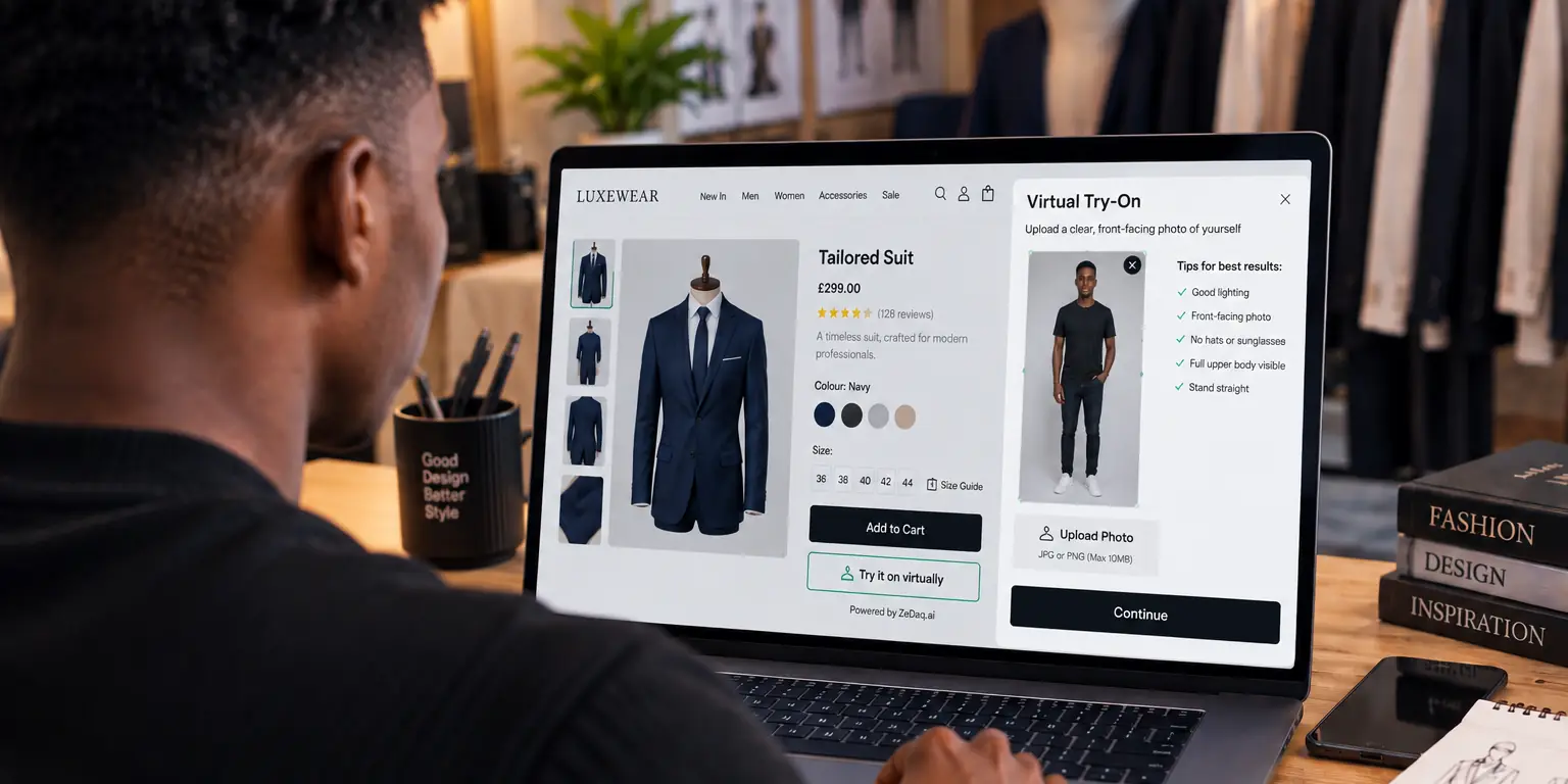
- A try-on button. The shopper sees the garment on themselves.
The page on showing which size the model wears covers the first of these. For a deeper look at placement, see where the try-on button should go.
How do you add fit help in Shopify without code?
If you use the ZeDaq.ai Shopify app, you add it through Shopify's theme editor rather than by editing code.
- Install the app from the Shopify App Store.
- In your admin, open Online Store → Themes → Customize.
- Turn on the app embed under App embeds.
- Set the garment type for the product.
- Open a product on your phone and check where the button appears.
If your theme supports app blocks, you can place the button yourself. The guide to placing a try-on button in your theme explains how.
See how a try-on button looks on a product page
Try it on yourself
Live renderUpload a photo, pick a piece, see it rendered on you.
Pick something to try on
What should you leave below the fold?
Move anything that does not help the shopper choose a size or add to cart. Common candidates:
- Long brand stories
- Full care instructions
- Detailed reviews, after a short summary near the title
- Upsell sections and "you may also like" rows
- Legal text
Shoppers who want these details will scroll. Shoppers who only need a size should not have to scroll past them.
What is a good checklist for your next page review?
Open three product pages on your phone and check:
- I can see the main photo and price without scrolling.
- I can pick a size without scrolling.
- Sold-out sizes are clearly marked.
- I can find fit help next to the size selector.
- The add to cart button is reachable with one thumb.
- The page does not jump around while images load.
If a page fails two or more, fix those before you add anything new. For more ideas on what else to compare, see the best AI virtual try-on apps for Shopify.
Add fit help next to your size selector
FAQs
Does the layout matter more on mobile?
Usually yes, because the fold comes earlier and thumbs are less precise than a mouse. Design for the small screen first, then check desktop.
Should the size selector come before or after the color choice?
Most pages put color first, then size, because color changes the images and sometimes which sizes are in stock. Test both on your own store.
Can I change the layout without a developer?
Often. Shopify themes let you reorder sections and blocks in the theme editor. Changes that go beyond that may need theme code.
Do I need a different layout for each product type?
Not usually. Keep the same order across the store so shoppers learn it. Only the fit help may change, for example a different size guide for shoes.
Try ZeDaq.ai free
Virtual try-on and Find my size for your store, plus client, order and invoicing tools for tailors, in one subscription.