How Fast Should a Virtual Try-On Result Load?
By the ZeDaq.ai team · · 4 min read
On this page
A virtual try-on result should load as fast as the technology allows, and the wait should never feel like a freeze. Rendering a garment on a shopper's photo takes longer than loading a normal page, so the goal is to show clear progress and keep the shopper's attention until the image appears.
This guide explains the research on waiting, how to design the loading state, and what to measure on your own store. It builds on the basics in virtual fitting rooms for clothing websites.
What counts as a "fast" response for shoppers?
Usability research gives three useful limits. Nielsen Norman Group's article on response times describes them like this:
| Limit | What it means for a shopper |
|---|---|
| 0.1 second | The system feels like it reacted instantly |
| 1 second | The shopper's flow of thought stays uninterrupted |
| 10 seconds | The limit for keeping the shopper's attention on the task |
Source: Nielsen Norman Group, "Response Times: The 3 Important Limits".
A rendered try-on image will usually sit past the first limits. That is normal. What matters is that the interface responds at once when the shopper taps, and that it says when the result will arrive.
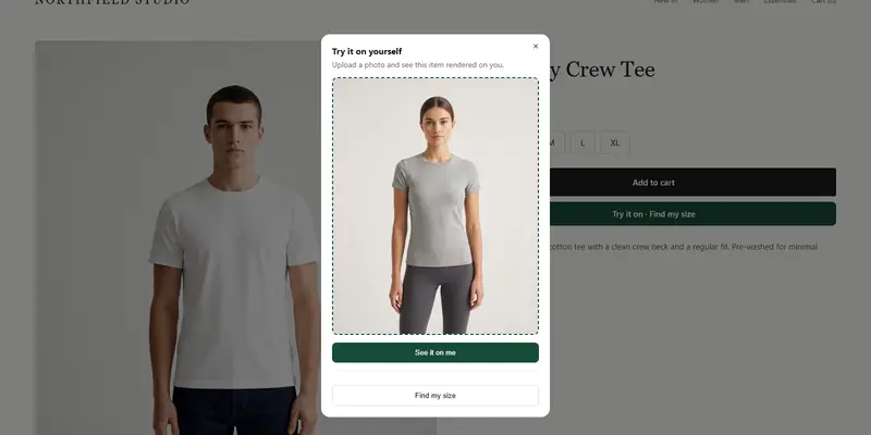
Time a try-on yourself
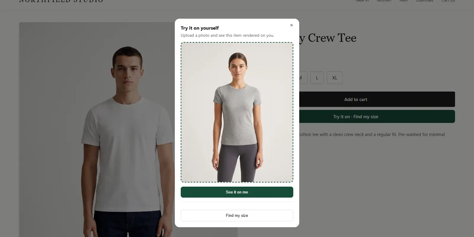
Try it on yourself
Live renderUpload a photo, pick a piece, see it rendered on you.
Pick something to try on
Which parts of a try-on need to be instant?
Split the experience into steps and treat each one differently:
- Opening the try-on window. This should feel immediate. The button must respond on tap.
- Choosing and previewing the photo. This happens on the shopper's device, so it can feel instant.
- Rendering the result. This is the slow step. It needs a progress state.
- Showing a size suggestion. For ZeDaq.ai, the body scan runs in the shopper's browser and only measurements are sent for sizing, so this step does not depend on image rendering.
Do not make the whole flow wait on the slowest step. Let the shopper keep browsing the product page while the result renders if your design allows it.
How do you design the wait?
Past about a second, people want to know the system is working. Past ten seconds, they start doing something else, according to the same Nielsen Norman Group research. Use these patterns:
- Acknowledge the tap immediately. Change the button state so the shopper knows it registered.
- Show progress in words. "Reading your photo", then "Fitting the garment" tells the shopper something is happening.
- Give an honest time hint. Tell people it can take a moment rather than showing a bar that stalls.
- Offer a way out. A cancel button prevents the shopper feeling trapped.
- Handle failure kindly. If the photo can't be used, say why and suggest a clearer photo.
How do you measure loading time on your own store?
Measure what shoppers see, not what the server reports. Time these points from your own phone on a normal mobile connection:
- Tap on the try-on button until the window opens.
- Photo chosen until the preview appears.
- Submit until the first sign of progress.
- Submit until the finished image shows.
Repeat on Wi-Fi and on mobile data, and on an older phone. Record the median, not the single best run.
Also check that the try-on does not slow the product page itself. Google's Core Web Vitals guidance sets "good" targets of 2.5 seconds or less for Largest Contentful Paint, 200 milliseconds or less for Interaction to Next Paint, and 0.1 or less for Cumulative Layout Shift. Load the try-on script with defer so it does not block the page.
What slows a try-on down, and what can you control?
Some factors are outside your control, such as the shopper's connection. Others are yours:
- Photo size. A very large photo takes longer to upload. Ask for a normal phone photo, not an original from a professional camera.
- Page weight. Heavy sliders and many other scripts compete with the try-on for the shopper's bandwidth.
- Garment images. Clean, well-lit product images help the result look right. They also keep your catalog consistent.
Good size data matters too, because a fast result that suggests the wrong size does not help. See how to write size guides for the chart basics.
What should your copy tell shoppers before they start?
Say what will happen before the shopper starts. A single line near the button works: "Upload one photo and see this item on you." Then tell people how to take a good photo, so they do not have to retry.
If you are still planning your rollout, how long a launch takes covers the setup steps, and whether results should be shareable covers what happens after the image appears.
See how the shopper experience feels
FAQs
Is there one correct loading time for virtual try-on?
No. Usability research gives limits for how waiting feels, but the render time depends on the technology and the connection. Focus on clear feedback and honest expectations.
Should I show a progress bar or a message?
Short, plain messages that describe the step work well. A bar that stalls feels worse than words that change.
Does a slow try-on hurt my product page speed?
It can if the script blocks rendering. Load it with defer and test your page against the Core Web Vitals targets.
What if the result fails to load?
Show a clear message, keep the photo so the shopper can try again, and point them to a standard size chart as a fallback.
Try ZeDaq.ai free
Virtual try-on and Find my size for your store, plus client, order and invoicing tools for tailors, in one subscription.