Color Mismatch Returns: Photography Fixes
By the ZeDaq.ai team · · 4 min read
On this page
- Why do colors look different on screen than in person?
- How should you set up lighting?
- How do you get accurate white balance?
- How much editing is too much?
- How should you name and describe colors?
- How can you show the real color on a person?
- What can you do after the order?
- What is a simple photo-session checklist?
- How do you check for color problems in your returns?
To reduce color mismatch returns, shoot every product in the same controlled light, use a gray card to set the white balance, avoid heavy editing, and give each color an honest, specific name. Shoppers return items when the garment looks different from the photo, so the fix starts at the camera.
This guide is a photography checklist for fashion store owners. Color is one of several "not as pictured" causes, and our work on AI size recommendation for fashion stores covers the fit side of the same problem.
Why do colors look different on screen than in person?
A garment's color depends on the light it is in, the camera that captured it, and the screen that displays it. Phones and monitors show colors differently, and no one can fully control the shopper's screen.
So your goal isn't a perfect match. It is a photo that is as close as possible and a page that tells shoppers what to expect.
How should you set up lighting?
Keep light consistent from product to product.
- Use daylight or daylight-balanced lamps. Mixed light, such as a window plus a warm bulb, shifts colors.
- Avoid direct sun. It creates harsh shadows and washes out dark and bright shades.
- Keep the same setup for the whole catalog, so shades are comparable.
Consistency also helps you spot problems. If one dress looks oddly warm next to the rest, you will see it.
How do you get accurate white balance?
White balance tells the camera what "neutral" looks like. If it is wrong, every color shifts.
- Put a neutral gray or white card in the first frame of a session.
- Set the white balance from the card, or fix it in editing.
- Apply the same setting to the other photos from that session.
This simple step often removes the yellow or blue cast that makes cream look pink or navy look black.
How much editing is too much?
Edit to match the real garment, not to make it more attractive. Boosting saturation or contrast may help a photo stand out, but it also makes the real item look duller on arrival.
Compare your edited photo to the physical garment, side by side, in daylight. If you have to squint to see the match, undo some of the edits.
How should you name and describe colors?
Use specific color names rather than vague ones. "Dusty rose" and "forest green" are better than "pink" and "green." Add a short note when a color is hard to judge, such as "deep navy, looks near-black indoors."
Show a close-up of the fabric as well. Texture and sheen change how color reads. If a color varies between production batches, say so on the page. The product page checklist for fashion stores lists the other details shoppers need.
How can you show the real color on a person?
Include at least one photo of the garment worn in natural light, since a flat lay doesn't show how color looks on skin. If you offer more than one model, shoppers can judge the color against their own skin tone.
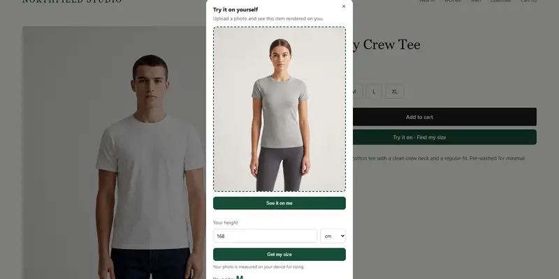
Virtual try-on can add another view: ZeDaq.ai shows the store's real garment on the shopper's own photo. The result depends on the product image you supply, so a well-shot image matters here too. It is not a replacement for accurate photos.
What can you do after the order?
A short email can set expectations before the parcel arrives. Mention that colors may look a little different from the screen. See post-purchase emails that prevent returns for ideas.
If the shopper keeps the item but wants a change, a fix might be possible. The article on common alteration fixes and their cost covers fit problems you can solve without a return. Our guide on writing size guides covers the fit side.
What is a simple photo-session checklist?
Print this and keep it by your shooting area:
- Set up in the same spot, with the same light, for every product.
- Photograph the gray card first.
- Shoot flat lay, worn and close-up for every color.
- View the photos on a phone and a laptop before you edit.
- Hold the garment next to the screen and compare.
- Save the shots with the color name in the file name.
The last step prevents a common error: mixing up two similar shades in the product listing.
How do you check for color problems in your returns?
Group your returns by reason and look for "color" or "not as pictured." Then look at the products. Are the problem colors always the same, such as reds, creams or navy? Those shades often shift the most between cameras and screens.
Reshoot those first, and add a color note on the page.
Show shoppers the real garment on their own photo
FAQs
Why does the color look different on my phone?
Each screen has its own brightness and color settings. That's why a photo that looks right on your monitor can look slightly different elsewhere.
Do I need a gray card?
It isn't required, but it's a cheap way to get consistent white balance across a shoot.
Should I add a color disclaimer?
A short line is fine, such as "colors may vary slightly by screen." It helps, but accurate photos matter more.
Can I fix color in editing instead?
Small corrections are fine. Large changes risk making the photo differ from the real item.
Try ZeDaq.ai free
Virtual try-on and Find my size for your store, plus client, order and invoicing tools for tailors, in one subscription.